Review the functionality and flow of the app, and review and edit all content
Project Brief
Variable Software, LLC created OwassoApp as a community guide and social app for residents of Owasso, Oklahoma.
The developer requested a content audit and UX review to identify
non-standard content, grammar, syntax, etc.
broken or non-working UX and UI
any other useful input to improve the app
Process
I met with the owner and developer for Variable Software, LLC (an app development company not to be confused with Variable Soft, a software company).
The owner asked for a full content audit and UX review. I began with the content audit and identified missing and superfluous content, then I edited the existing content. Finally, I checked the functionality and flow of each screen and recommended adjustments.
Problem
The developer’s expertise is web development and coding. He required UX review to identify problems with the app.
My Role
I was responsible for reviewing all aspects of the app, concentrating on content, UX, and UI.
The app is easy to navigate and easy to understand.
All functions – except as noted below –work as expected.
The app is clean and engaging.
The app has really useful features, especially when they’re more complete (as noted below).
Allowing community/user input engages users.
Change
Some buttons look like CTAs but aren’t CTAs. Consider using different style buttons for different functions.
The circles for photos on CTAs for schools, services, churches, etc. are different sizes.
The CTA buttons and tiles look too much alike.
Accessibility of text over photos is tricky; ensure sufficient contrast for readability; consider adding a gradient overlay to create contrast.
Splash Screen
Keep
The photo is engaging and pertinent to the community.
Change
Though engaging, the photo is really dark.
“Var soft;” at the bottom of the screen is confusing.
Home Screens
Keep
The photos are engaging and pertinent to the community.
Change
Consider pinning the note from the app to the top of the screen.
Also, consider rewording that note to “Users, please click here and share your thoughts about which parts of the app add value to your experience as a user.”
Inconsistent use of initial caps on photo labels – I didn’t review all of these because I’m uncertain about who’s adding them. If users add them, of course the app doesn’t change user input. If the app adds them, I’ll review for grammar and initial caps.
Change
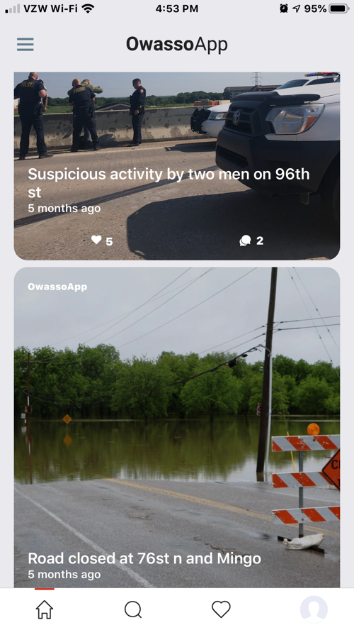
Consider adding a date for each post. For example, a date for things like the tornado warning, the suspicious activity, and the road closure would be helpful.
For the future: linking these photos to a story would add to the value. For example, these could link to a news story, and the lip synch post could link to a video or news story.
At least some of these photos seem to be user-added photos, but I don’t see an add button.
Change
Why does the home page have a link to the laundry?
Sign-In Screen
Keep
The email keyboard is great – so many designers don’t bother, and that’s frustrating for users.
The “working” message is great – lets users know that the app is doing something and hasn’t just locked up.
The error message is clear; also, good use of color and text for this.
Change
“… help you stay inform with Owasso’s activities” should be “informed about activities in Owasso.”
Inconsistent use of initial caps
Police Incidents Screens
Change
Consider removing the floating link to the laundry.
Keep
This is a really useful feature.
The incident icons are great.
Change
The incident count button on the incidents list page is a button – it functions like a button, but it doesn’t look like other buttons in the app.
Should there be a mechanism to acknowledge citizen concern reports? Does it feel like the report goes into a void otherwise?
News Roundup Screen
Change
The tile isn’t updated: “Tune in every Friday! See you guys tomorrow!” But that was 12 days ago (the day I reviewed it), so a Friday has passed.
Consider deleting guys. Consider substituting “See y’all then!” Or “See y’all later!” etc. as more in line with local culture.
Search Owasso Screens
Keep
The photos are engaging and pertinent to the community.
Change
“Today’s Coupons” doesn’t lead to coupons, just to pictures of food.
Delete the period after the subheading since it isn’t a sentence.
Change
Clicking on “Today’s Coupons” leads to this page, but there is no coupon.
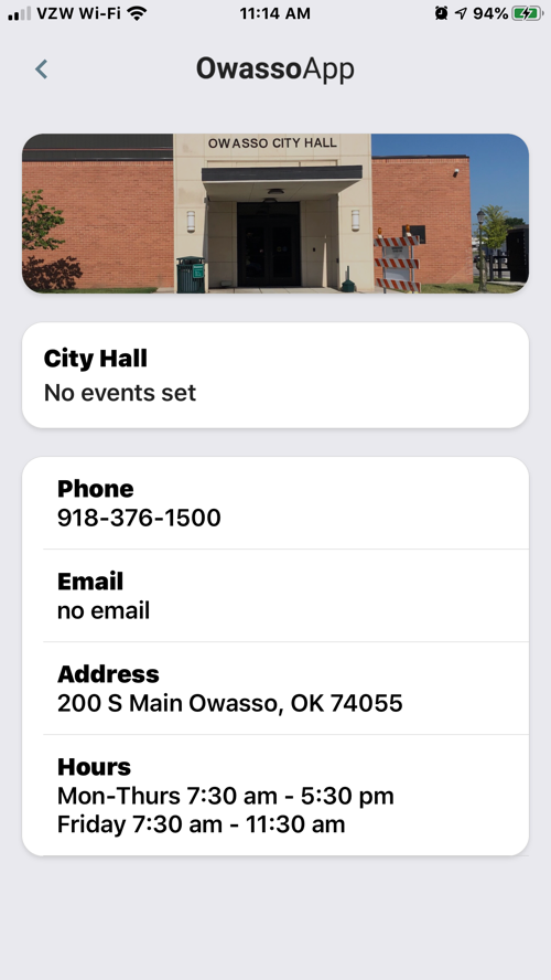
City Hall Screen
Change
Be consistent about spaces around hyphens (should have no spaces when indicating a range, as in the days of the week and hours of operation).
Police Department Screen
Change
The mission is likely a direct quote from the PD – so probably not changeable – but in case it’s not a direct quote, the list is not parallel (it should be either “to work in partnership with …, to enforce the laws, and to enhance …” or “to work in partnership with …, enforce the laws, and enhance ….”
Also, serial commas make lists more readable.
Fire Department Screen
Change
The address should be 11933 E 116th not 12311933.
Use either to or hyphens to indicate ranges but be consistent from page to page; you’ve used hyphens on some pages and to on others.
“(Except Designated Holidays)” does not take all initial caps: either no initial caps or Except only.
Restaurants Screen
Keep
This will be a great feature for the app, especially when it’s filled in more.
Schools Screens
Keep
This is a great feature. I love that users can can sign up for updates.
The individual school contact numbers and calendars are very helpful.
Local Services Screens
Keep
I love this feature, especially when it’s filled in more.
Change
Use a – (option + dash on Apple, alt + 0150 on Windows), not a simple dash in the tagline.
The bottom button looks like a CTA but isn’t a CTA and has inconsistent use of initial caps.
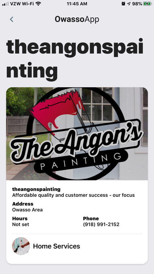
Change
The title for the Angon’s services and home services page has no spaces and doesn’t fit on the screen:
theangonspai
nting.
Change
Picky but thorough: on the services page, use commas consistently (pressure washing is different from the other listings).
Change
Why no initial caps for the business name – is that an intentional style decision?
The icon for the services CTA is different from the icon for Angon’s services CTA.
This bottom button looks like a CTA but isn’t a CTA.
Change
Delete the spaces around the hyphen for the hours.
Change
The gray text is incomplete and does not open additional dialog, as an ellipsis conventionally indicates.
Change
We now capitalize the second word in hyphenated words when the first word is capitalized: Drop-Off Service.
Inconsistent use of initial caps in gray text
Change
Some of the gray text is incomplete and does not open additional dialog, as an ellipsis conventionally indicates.
Change
This page doesn’t show or lead to any specials.
Another instance of no initial caps for the business name
Churches Screens
Keep
This is another helpful feature.
I love the mechanism to add your church.
Change
Do you mean for users to have to contact the app to view interactive content, including the full phone number for a church? I got this popup every time I clicked on something in these listings.
Jobs Screens
Keep
This is another useful feature.
The add button wasn’t immediately obvious (didn’t jump out) but was easy to find when I looked and consistent with other pages.
Change
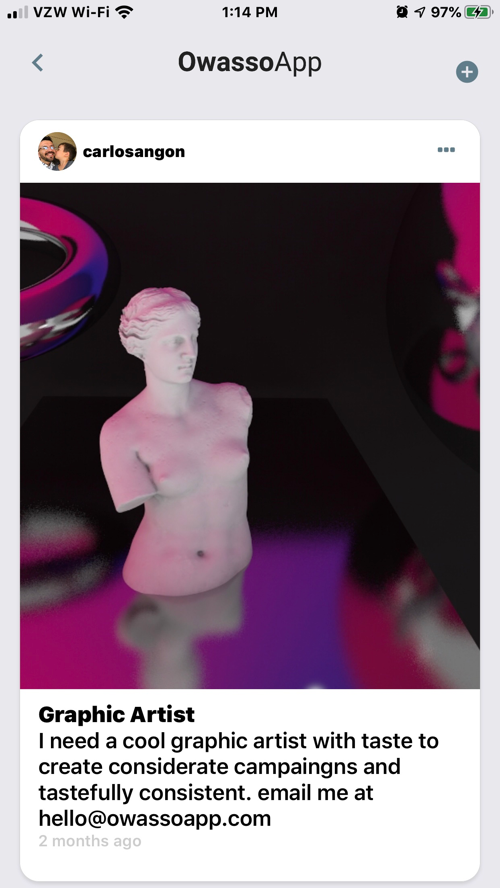
The text over the photo should be “Find a job that’s perfect for you.”
Or consider deleting it altogether since you have a similar subheading.
Change
This listing should read: “I need a cool graphic artist with taste and consistency to create campaigns (typo). (Also, I think you didn’t mean considerate campaigns.)
“Email me …” (initial cap)
Change
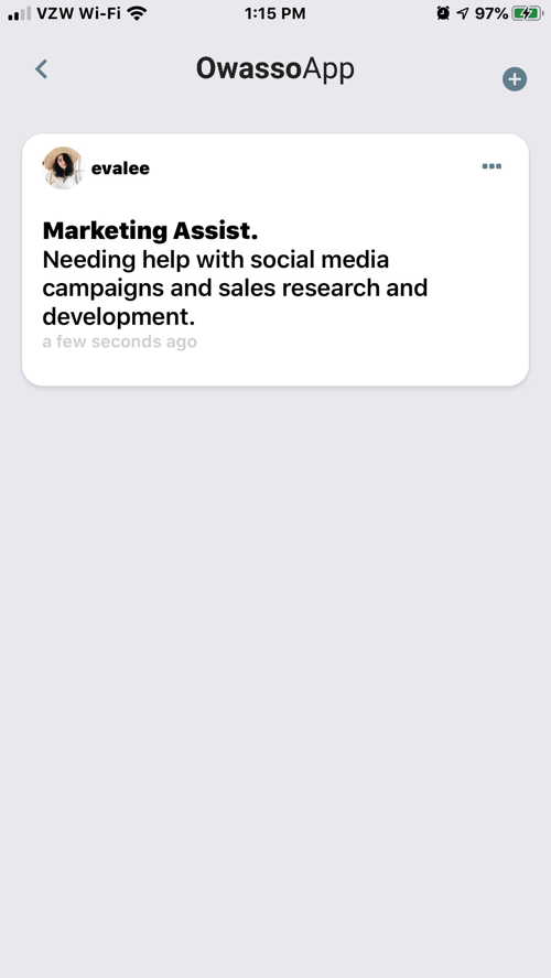
This post doesn’t have a contact. Consider making this a required element.
The date stamp has been “a few seconds ago” for several days.
Activity Screen
Keep
This is a really useful page. I like that users are able to review their activity in the app, especially a social media app.
Change
Delete the period in the subheading; it isn’t a sentence.
This doesn’t seem like a list of latest user engagements. I think that may be a language thing; when I first read it, I thought of engagement as in engagement calendar, but I think you mean engagement as in engagement with the app. Maybe consider deleting the subtitle and changing the title to Your Activity.
Is there a mechanism to edit or delete interactions? I couldn’t find a way, for example, to delete likes. Since I haven’t posted anything, I don’t know whether I could edit or delete a post.
Setup Screen
Change
Inconsistent initial caps and font sizes in the two headings
The subheading should read “We recommend uploading a profile picture and activating alerts.”
Consider deleting the subheading after Alerts Settings.
Serial commas make lists more readable (gray text).
Menu Screen
Keep
User-friendly and accessible
Change
This button looks like it might be a CTA, but it isn’t one; could it be?
Change
Delete the period after the subtitle since it isn’t a sentence.
Change to first paragraph “… on a variety of topics. Our focus …”
Questions and Feedback, Report, and Terms buttons look like a CTA, but are not; could they be?
Change
Consider deleting the subheading after Alerts Settings.
Serial commas make lists more readable in all these lists (gray text).