UX review of the online ordering tool for the Torchy’s Tacos app (which has since been updated and improved)
Scope
Review the online ordering tool for friction points and triggers
Project Brief
This project is a UX review.
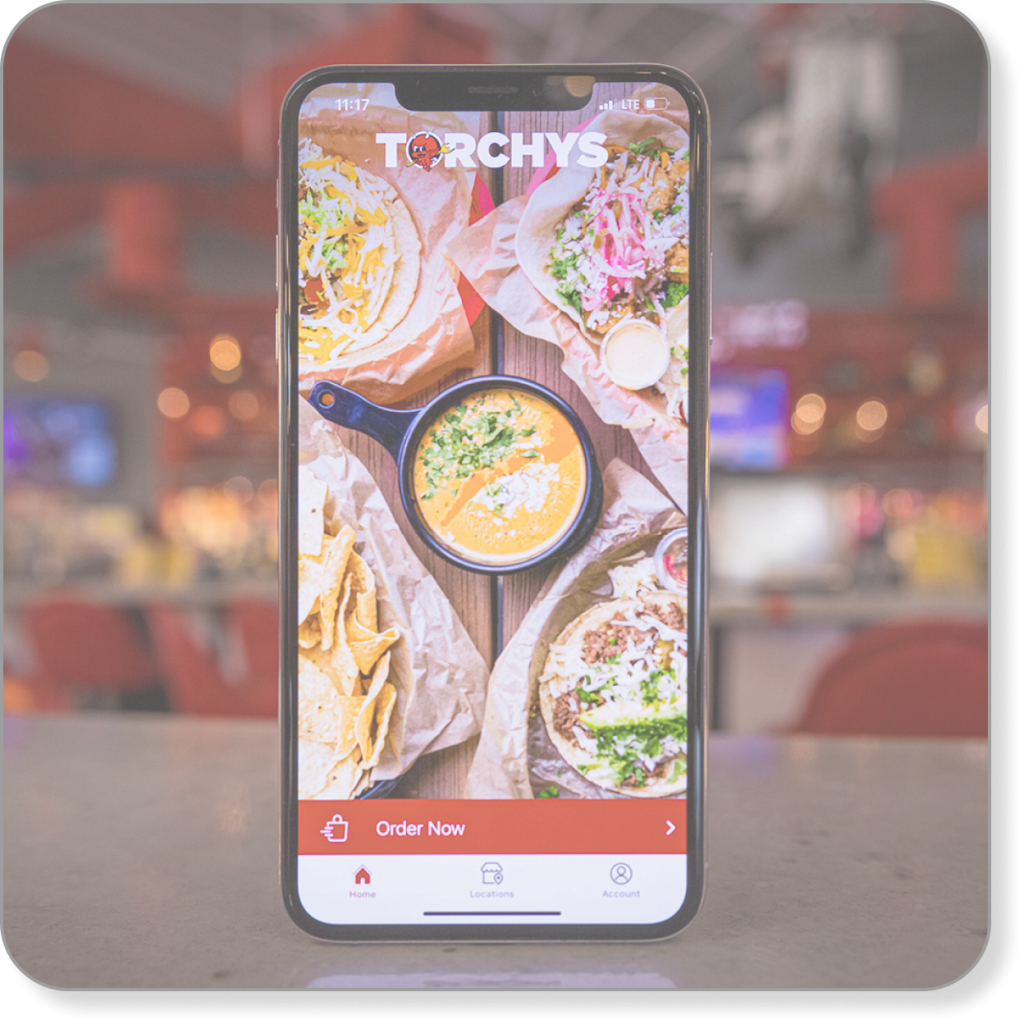
Torchy’s Tacos is a taco restaurant (surprise!) with an online ordering tool.
Problem
The online ordering tool was unintuitive, clunky, and filled with friction points. I reviewed the tool for
friction points and triggers
broken or non-working UX and UI
any other useful input to improve the tool
My Role
I reviewed the functionality and flow of the online ordering tool, moving page by page through the ordering process and concentrating on friction points, triggers, and UX/UI.
Process
I started with the beginning of the ordering process and worked my way through each step to checkout.
Along the way, I noted barriers and frustrations (friction points) and points where the tool was simple and intuitive (triggers).
Group order option and URL to share with group members
Order ahead option
Easy payment options
Simple, straightforward, accessible checkout
Change
No description of some upgrade options
A few unclear customizing outcomes
Inconvenient list of add-ons
No indication of how to order multiples until the review screen – after the user is finished ordering
Location
Friction Point
The first choice in the ordering tool is which location to place your order with.
When I opened the location function, the map didn’t display a location near me, but I know there was one. What? Has my location closed?
But I persisted. I typed in my ZIP code and the tool produced my Tulsa location.
Ordering
Trigger
Grouping menu items into intuitive categories meets usability needs, and including descriptions to help users understand what they’re ordering meets proficiency needs.
Trigger
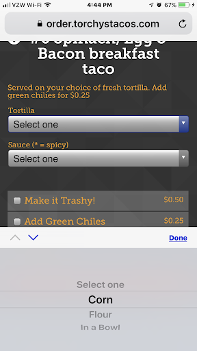
Choosing a tortilla or sauce option is simple and intuitive (long scrolling menus can frustrate users, but these are manageable).
Friction Point
Users are ordering on an app, so chances are, they’ll have a delay between when it’s ready and when they eat it.
Customers don’t want soggy tacos, so they want to add the sauce when they’re ready to eat, but the menu gives no indication or choice for ordering the sauce on the side. Hint: It’s always on the side, but new users don’t know that.
Friction Points
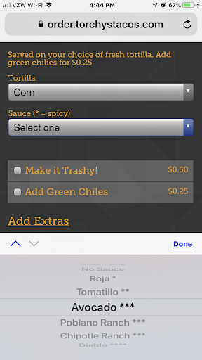
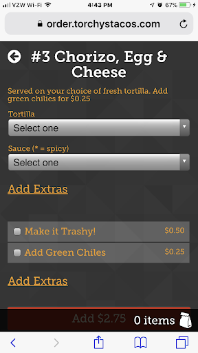
Trashy? What’s trashy? Customers don’t know what they’d be ordering and changing their mind means extra clicks.
Maybe they don’t want chorizo today (just kidding – who doesn’t want chorizo), but if they change their mind, clicking back goes to the main menu, not to the breakfast menu: extra clicks.
Friction Points
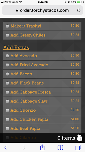
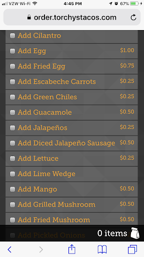
Choices! We love choices, but wow, that’s a lot of scrolling. At least alphabetize the list, so users can find what they’re looking for faster.
Plus, they can add a lot of stuff to their taco, but they can’t add an extra taco? If they want two or more of the same, they have to enter them separately.
Trigger
A single order or a group order? Now, that’s a thoughtful feature. Ordering for your team? No problem!
Friction Point
But wait! Here they are at the end of ordering and what do they find? They can add multiples at the end instead of as they choose each taco? Whose idea was that?
Triggers
The essential elements on this crucial page are easy and intuitive.
Payment options – online or at the store – are a convenient option.
The process requires scrolling, but that allows for larger fields and increases accessibility.
Checkout is easy and straightforward.
I know. Now you want to order tacos. If there’s a Torchy’s near you, you can’t go wrong. The new ordering tool is much improved and the tacos are fabulous! (Not a paid endorsement)